

Stream count told us little. Save rate showed who we were reaching.
Updated September 2026. An earlier version of this post said tracks above a 20% save rate and a 2.0 stream-to-listener ratio trigger algorithmic playlist placement within 10 to 14 days. Our own data could not support that, so we removed it.
The first question every label asks when a campaign wraps: "How many streams did we get?"
Wrong question. We've been running campaigns across two artists at completely different scales, budgets, and genres, and the stream count told us basically nothing about what actually happened. One artist was pulling around 15,000 daily streams at a 3.2% save rate. The other had around 4,000 daily streams at a 17.4% save rate. The second artist was in way better shape, and everything that happened over the next few months proved it.
Same platforms. Same tools. Same team running it. The difference was who was listening and whether they cared enough to come back.
The Vanity Metric Test
We ran this comparison within each campaign, not just between them. Same artist, same music, different traffic sources. The results were pretty clear.
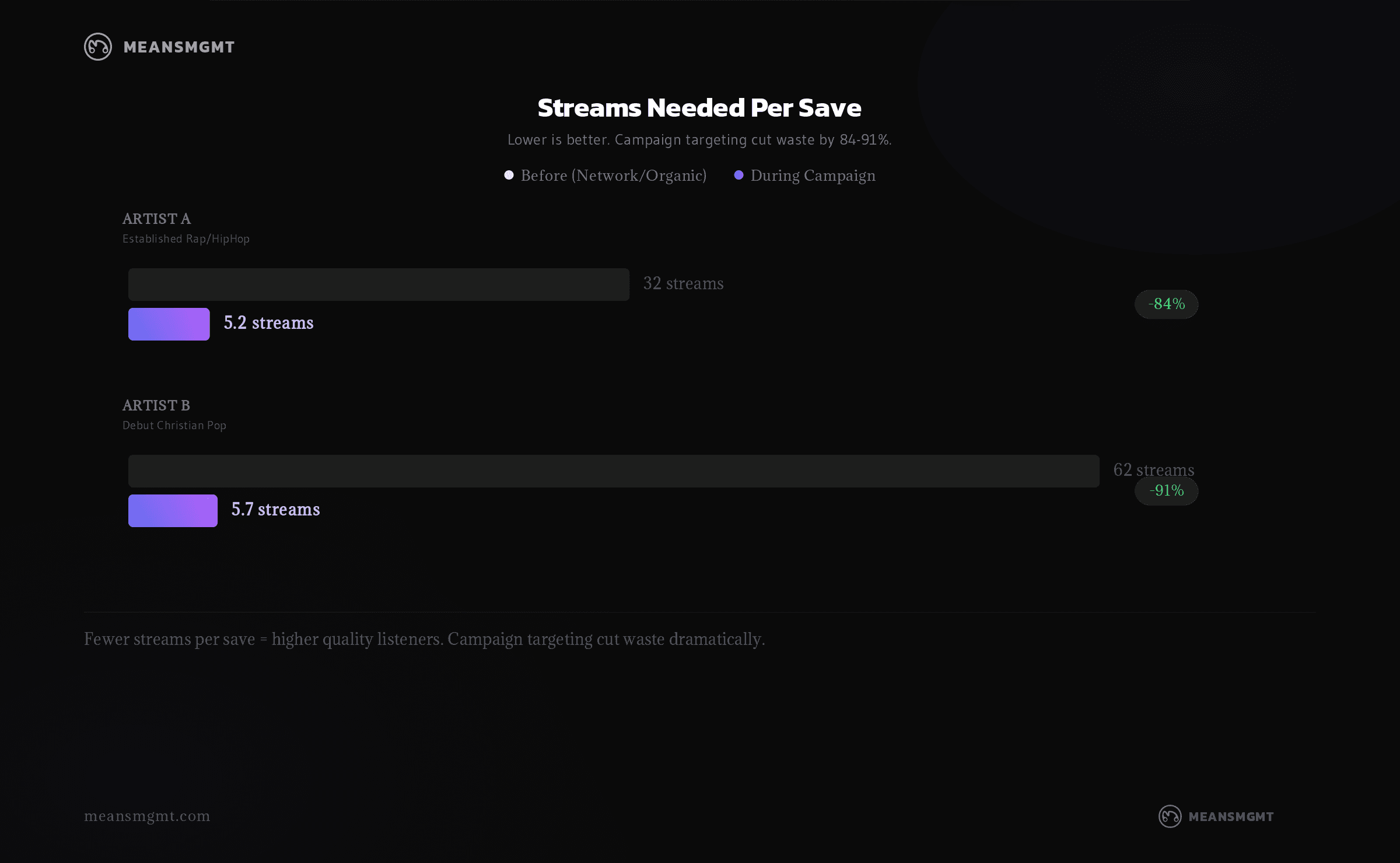
Artist A is an established act. Over the course of a multi-platform campaign, we tracked two very different phases. Early on, network-driven traffic (playlist placements, organic social, PR pushes) was delivering around 15,000 streams per day. Sounds solid. But only 481 of those daily listeners saved the track. That's a 3.2% save rate, or roughly 1 save for every 32 streams.
When we shifted to campaign-driven traffic through Meta Ads targeting, daily streams jumped to 81,000. More importantly, daily saves hit 15,714. That's a 19.4% save rate, or 1 save for every 5 streams. Stream volume increased 5x. Save rate increased 6x, which told us the campaign was reaching people who wanted the song.
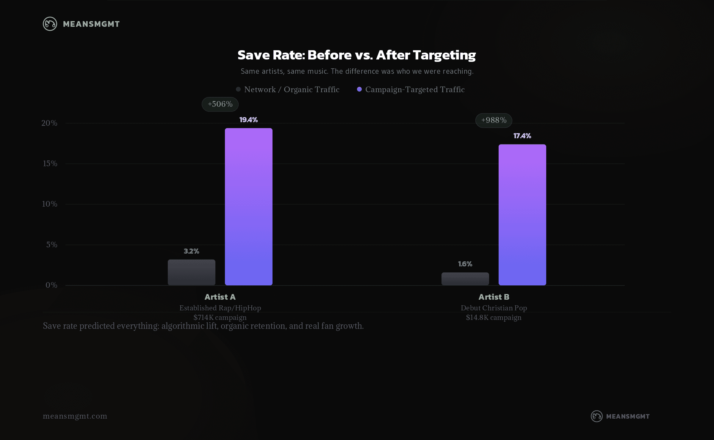
Artist B told the same story at a fraction of the budget. A debut artist, launched from literally zero Spotify presence with a much smaller budget across several ad platforms. On release day, streams spiked to 4,587. Normal release energy. But the save rate was only 1.6%, with 62 streams needed to produce a single save.
Fast forward to the peak of our campaign push, about three months later. Daily stream volume was comparable, but the save rate had climbed to 17.4%, with only 5.7 streams per save. Daily saves went from 74 to 725. That's a +880% increase in saves on similar stream volume.
Same artist. Same songs. The difference was entirely in who we were reaching.
What Save Rate Actually Measures
A stream is passive. Someone heard your song. Maybe they were paying attention, maybe it was background noise. A save is active. Someone heard your song and made a deliberate choice: "I want to hear this again."
That distinction matters. Spotify says saving to your library is one of the actions that shapes what it recommends to you. It does not publish how much a save counts, or any save rate that triggers a playlist, and we have not found one either.
There is also a catch. During a campaign, save rate mostly reflects who the ads reached. The people an ad sends to Spotify just chose to hear the song, and many of them save it. When we lined up 132 source-of-streams windows across nine artists, monthly save rate rose and fell with ad spend. So read save rate mid-campaign as a check on your targeting, and compare it against the same artist's months without ads.
So save rate isn't just a reporting metric you throw in the deck. It's an early read on whether your ads are reaching people who want the music.
The Algorithmic Flywheel
Both campaigns showed the same pattern, just at different scales. Paid traffic drove saves. Saves fed the algorithm. The algorithm surfaced the music organically. Those organic listeners saved too. The cycle compounds.
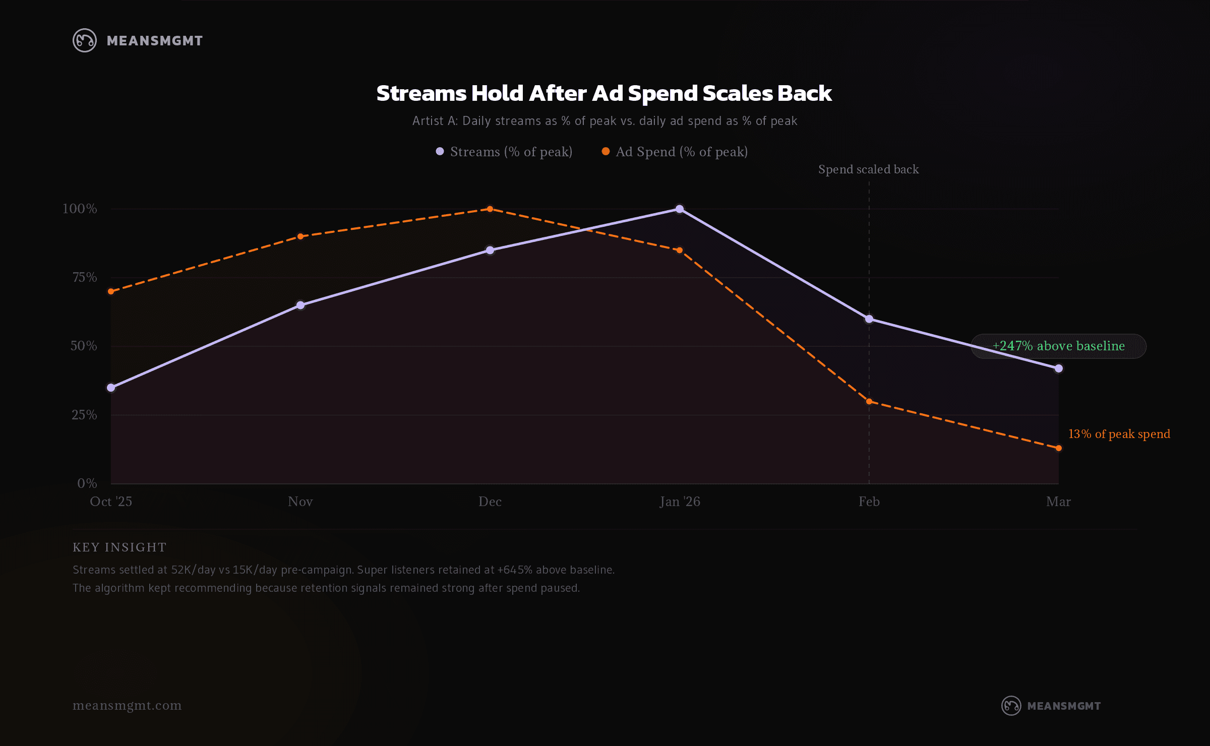
Artist A (established, larger campaign): Monthly listeners went from 206K to a peak of 763K. When the campaign paused, we expected the usual dropoff. Here's what actually happened: streams settled at +247% above baseline (52K/day vs 15K/day pre-campaign). Monthly listeners held at 588K (+190%). Super listeners (the people who stream repeatedly and save everything) went from 1,600 to a peak of 19,000 and retained at 12,000 post-pause. That's +645% above where we started.
The algorithm kept working because it had hundreds of thousands of retention signals to act on. The campaign didn't just rent streams. It built a listener base that Spotify's own systems decided was worth recommending to more people.
Artist B (debut, modest budget): Starting from zero made the pattern even clearer. Within 145 days, monthly listeners hit 40,874. But the most telling number is where those listeners came from. By the end of the campaign, Radio & Autoplay was the #1 discovery source with 40,210 listeners. That's Spotify's algorithm actively recommending this debut artist to tens of thousands of people through its own surfaces.
The artist-owned playlist we built grew to 2,313 follows and became the only listener source still growing after ad spend scaled back. With spend reduced to roughly 10% of peak levels, monthly listeners held at 32,170. That's 79% retention of peak audience on a fraction of the investment.
Total programmed source listeners hit 88,558. Those are people who found the music through Spotify's own playlists and recommendations. For a debut artist on a modest budget, that's the algorithm doing the heavy lifting.
What This Means for Labels
If you're evaluating campaign partners by stream count, you're optimizing for the wrong thing. A vendor delivering 50,000 streams per day at a 1% save rate is renting you attention. A partner delivering 15,000 streams per day at a 15% save rate is building you an asset that keeps paying after the invoices stop.
Here's what to actually look at when reviewing campaign performance.
Save rate by phase. Not the overall average. How did it trend from launch to peak to scale-back? An increasing save rate means the targeting is getting sharper. A declining one means you're burning through your best audiences.
Streams per save. This is the efficiency number. Artist A needed 32 streams per save at the network level. During the campaign, it took 5. That's the difference between a 3% and a 19% save rate, and it's a lot harder to wave off when you frame it that way.
Post-campaign retention. What happens to streams 30, 60, 90 days after spend pauses? This is the real report card. If streams drop to pre-campaign levels immediately, the campaign generated attention but not fans. If they hold (like Artist A's +247% or Artist B's 79% retention), the campaign generated actual lasting growth.
Algorithmic source growth. Check Spotify for Artists. Is Radio & Autoplay growing? Are listener-owned playlists increasing? These are signals that the algorithm picked up on the retention data your campaign generated. If these sources aren't moving, the campaign isn't creating the compounding effect that justifies the spend.
The Bottom Line
Stream count is the number everyone reports because it's the easiest one to make look good. Save rate is the better early read on who you are actually reaching.
We saw it across both campaigns, at budgets wildly apart. Save rate was the clearest early read on who we were reaching. What it did not do is trigger the algorithm on its own, and we no longer treat it as a switch.
We build campaigns around retention signals because that's what drives long-term value for the catalog. If you want to see what your current campaigns are actually producing beyond the vanity numbers, reach out. We're always happy to take a look.

This is the work we do all day.
If you have a release coming, the 3-minute intake tells us everything we need to scope your campaign. Want the numbers first? The benchmarks report is free.

